Don’t use Tailwind for your design system, UI framework or component system, call it whatever you prefer. Tailwind isn't component-driven, although it claims to be, and you might struggle to develop a design system with it. I will explain why in this post.
I have recently read a lot of opinions about Tailwind (mxstbr's thoughts, jaredcwhite's opinion, Tailwind versus BEM) and while I agree with many of the points made, I have a different perspective.
In this post I will try to explain the drawbacks when using Tailwind to create a design system, focusing on the technical aspect of the components. I'm assuming that the reader is familiar with design systems, React and has basic programming skills. You can read more about design systems here or here.
A little bit about my experience
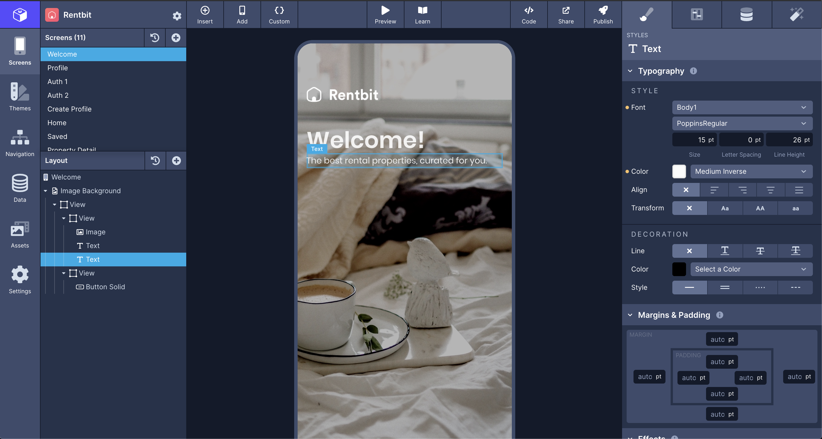
At the time of writing I'm working at Draftbit and our frontend is built on top of ReasonReact using Tailwind. It has ~500 components. The main page, called the builder looks like this:
I have also contributed to a few design systems in my career, even written my own.
I'm obsessed with the conjunction of component-drive design with functional programming and how these enable the writing of modular UIs.
But now, let's talk about Tailwind.
First, the good parts
The reason I think Tailwind is amazing has nothing to do with the patterns of utility classes. These patterns have been around for a long time -tachyons created around 2016. While some people find them pleasant to use, I personally prefer to write the CSS code directly.
The reasons why I think Tailwind shines are:
- Theme with strong defaults, beautiful and scalar: The config file generates all the values needed to produce a scaled system based on design tokens, like spacing. For example the defaultConfig will generate spacing based on a scale from 0 to 96 that goes from 0px until 24rems. defaultConfig
- Extendability: The ability to extend values in the config file allows the possibility to represent any design and propagate the right CSS properties. For example, spacing would generate the values for margins, padding, width, min-height, min-height, etc.
- Just CSS It's not an abstraction, or coupled to any framework. It can be used with minimal setup. All IDE would have support for it, all frontend/fullstack frameworks can integrate easily, there's ton of build tools to optimise performance, because it's just "The Platform". It makes adopation easier and future-proof.
How is used in React
I use React as an example, but it is used very similar to any other component-based UI library. In particular, React uses JSX via Babel (or any transpiler) which to transform JSX to function calls and eventually will endup as DOM elements.
During this transformation className gets renamed to class (since it's a reserved keyword in JavaScript) which applies CSS classes to elements.
This is the de facto method to use Tailwind with React. For example you will often will see:
<div className="flex md:block w-32 h-full" /><div className="flex md:block w-32 h-full" />What's wrong with className
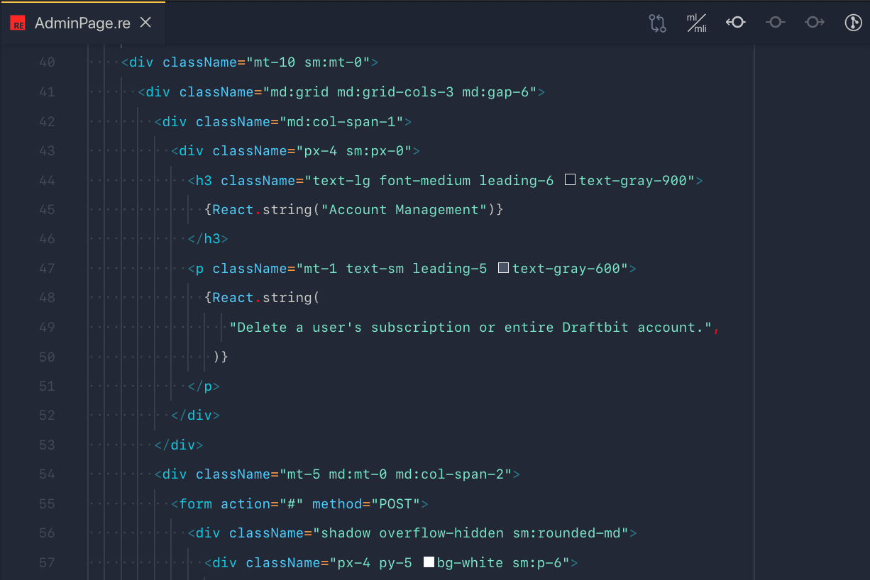
Hard to maintain
Removing one of the classNames from the list is prone to error.
It is like removing an unused CSS class in an append only stylesheet. They can collide with and override other properties.
There're a lot of tools to solve that particular issue, such as linters or editor plugins. But it's still a problem.
Aside from being hard to remove, Tailwind classes are hard to change. Adding classes might seem simple and fast while creating components, but it will slow you down when modifying or refactoring them; when your component comprises nested elements created with many Tailwind utilities you won’t be able to safely refactor your structure.
It is optimised for writing, not for reading
When reading JSX, I feel confortable to imagine a 1-to-1 match with the UI. I can easily navigate thought the component tree and map with the real-world interface.
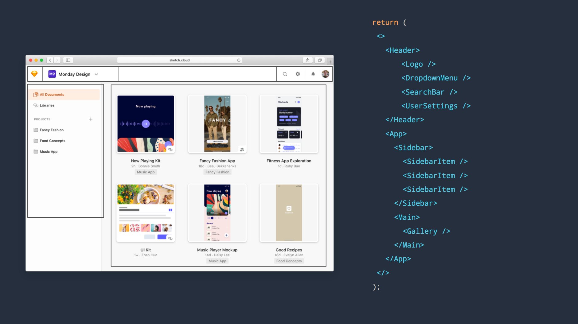
This UI is doable in Tailwind, but at some level, within the components you will find a layer with a bunch of classNames that you need to first parse in your head in order to imagine the UI.
There's a famous quote floating around... "Best code isn't optimised to be written, instead, it's optimised to be read".
Fails at dynamic styling
Dynamic Styling means having a component that exposes the possibility to change its style based on a prop. These props, are often called variants. For example, a button component might have a variant prop that can be primary, secondary, tertiary, etc.
This dynamic styling is a common pattern in design systems and it's hard to achieve with Tailwind. Since you would need to re implement the same Tailwind tokens as variables, make a mapping between those variants and the Tailwind classes and then apply them to the component.
Creating a component API that is coherent, versatile and scoped is relatively hard in itself. Doing so requires a good understanding of the problems that the component is trying to solve. So, allowing styling values to be driven by Tailwind is an added complexity that I found very annoying.
There's a definite disconnect between a CSS API and a component API. For a design system, I care more about getting the component one right - @sarah_federman
To give a simple example: If you want to create a component with a prop like gap. gap accepts all the possible spacing values that Tailwind does. Let's see how we do that:
const Card = (props) => {
  const className = "p-" + props.gap.toString();
  return <div className={className} />;
};

<Card gap={3} />;
const Card = (props) => {
const className = "p-" + props.gap.toString();
return <div className={className} />;
};
<Card gap={3} />;Now, our Card component accepts the value for paddind which creates a few issues. For instance gap could technically be any string, like "4 flex" and it will break all the UI.
If you abuse the usage of classNames inside your components, it can be a real pain to implement the intermediate logic between your component API and your Tailwind utility classes.
Impossible to derive styles
Derived styles are a nice usage of JavaScript values to generate scalar UI. Since Tailwind uses those utilities it's very tempting to use them for your components, making derived values impossible.
For example, having a <Link /> component with color="text-mono-100" initially it make sense since text-mono-100 represents the desired color. But, probably later there will be a need to style the link with a different color on hover. You could add another prop called hoverColor="text-mono-200" and call it a day.
But the fact that color is represented in another format it's a nightmare, often UIs derive styles from props. In the example above, you could have a color be their hexadecimal representation color="#b54c4c" and derive the hoverColor with an 80% of opacity, that would be possible if colors have a hexadecimal representation.
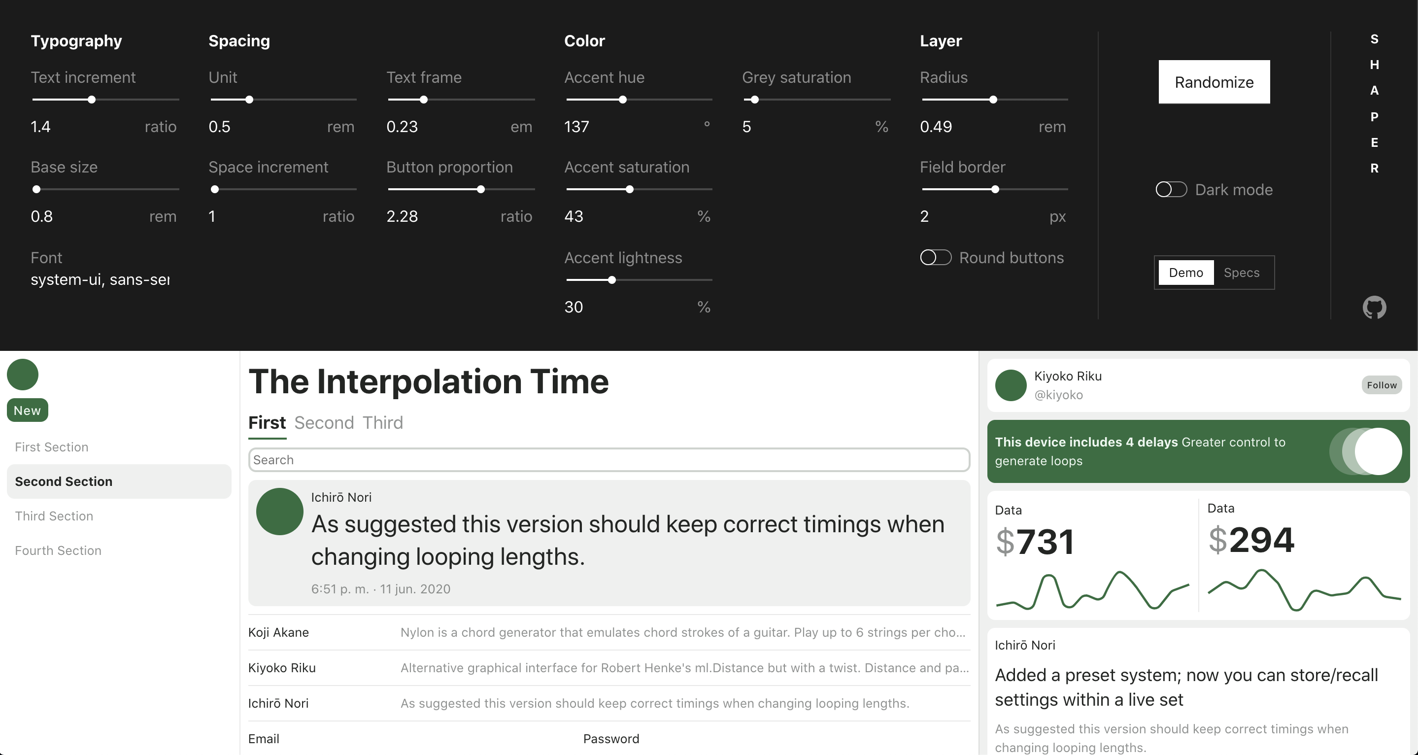
The Tailwind atomic language is nice to avoid typing CSS but isn't made for component APIs that use any sort of dynamic theme, making impossible (or very hard) to accomplish generative UI.
Here's an example https://hihayk.github.io/shaper
Breaks style encapsulation
I consider harmful to allow className as a prop on the component's API. This is often done to have flexibility from the outside to enable customisation of your component.
const Button = ({ ...props, className }) => (
  <button className={"flex text-mono-100 p-4 " + className} />
)
const Button = ({ ...props, className }) => (
<button className={"flex text-mono-100 p-4 " + className} />
)But it's a trap. Designing a closed API for those customisations would battle-test your component and force you to decide on an API that have some boundaries, which is the initial goal of making a component.
Tailwind doesn't have any opinion on this, but it's very tempting to allow any sort of className from the outside in your classNames, given that you need customisation from the outside.
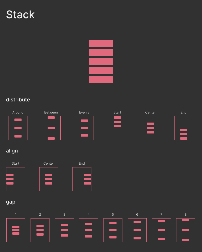
Stack: Example of variants
There're a lot of implementations of Stack. That's a screenshot of mine.
Stack places a list of elements on the Y axis, one on top of the other. It adds consistent spacing between them and moves them horizontally or vertically. It's an abstraction on top of flexbox, but limited. Those constraints are defined mostly by the designer, having a component that enforces the number of variants it's generally a good thing.
Composing at the wrong layer
The key feature of React is composition of components. Composition here means the possibility to plug those components like a lego which enables create more complex components based on more simple ones.
With React, "components" are a set of rules that React forces on top of just functions. The rules are simple which enables React to perform many benefits that we take for granted. Those rules, are better explained by Dan Abramov in one of his posts, Writing resilent components.
As I mentioned before, appending strings to style your component feels like a step backwards. Composing components that are made to solve one thing, It's the pattern that I trend to prefer.
The composition of components allows React components, to benefit from
- Declarative representation of the UI. Create complex pieces of UI based on smaller ones.
- Decoupled: Isolate UI problems into black boxes that doesn't know anything about it's context.
- Variants Implement variants of the same component, without he need to re-implement different versions.
Example of component composition over Tailwind
Re-implementation of Charkra's UI Box component into a pseudo design-system and Tailwind.

Here you can see the different approaches to the same UI
<Box padding={5} width="320px" border="sm">
<Stack gap={2}>
<Image borderRadius="md" src="https://bit.ly/2k1H1t6" />
<Row gap={2}>
<Badge color="#702459">Plus</Badge>
<Spacer left={2}>
<Text size="sm" weight="bold" color="#702459">
VERIFIED • CAPE TOWN
</Text>
</Spacer>
</Row>
<Text size="xl" weight="semibold">
Modern, Chic Penthouse with Mountain, City & Sea Views
</Text>
<Text>$119/night</Text>
<Row gap={1}>
<Icon src={MdStar} color="#ED8936" />
<Text size="sm">
<Text size="sm" weight="bold">
4.84
</Text>{" "}
(190)
</Text>
</Row>
</Stack>
</Box><Box padding={5} width="320px" border="sm">
<Stack gap={2}>
<Image borderRadius="md" src="https://bit.ly/2k1H1t6" />
<Row gap={2}>
<Badge color="#702459">Plus</Badge>
<Spacer left={2}>
<Text size="sm" weight="bold" color="#702459">
VERIFIED • CAPE TOWN
</Text>
</Spacer>
</Row>
<Text size="xl" weight="semibold">
Modern, Chic Penthouse with Mountain, City & Sea Views
</Text>
<Text>$119/night</Text>
<Row gap={1}>
<Icon src={MdStar} color="#ED8936" />
<Text size="sm">
<Text size="sm" weight="bold">
4.84
</Text>{" "}
(190)
</Text>
</Row>
</Stack>
</Box><div className="p-5 w-32 rounded">
<div className="flex">
<img className="rounded w-full" src="https://bit.ly/2k1H1t6" />
<div className="flex flex-row mt-2">
<div className="rounded py-2 px-4 bg-mono-400">
<div className="text-mono-100">Plus</div>
</div>
<div className="text-sm font-bold text-pale-100">
VERIFIED • CAPE TOWN
</div>
</div>
<span className="text-xl font-semibold">
Modern, Chic Penthouse with Mountain, City & Sea Views
</span>
<span className="text-xl font-semibold">$119/night</span>
<div className="flex flex-row items-center">
<Icon src={MdStar} color="#ED8936" />
<span className="text-sm">
<span className="font-bold">4.84</span>
(190)
</span>
</div>
</div>
</div><div className="p-5 w-32 rounded">
<div className="flex">
<img className="rounded w-full" src="https://bit.ly/2k1H1t6" />
<div className="flex flex-row mt-2">
<div className="rounded py-2 px-4 bg-mono-400">
<div className="text-mono-100">Plus</div>
</div>
<div className="text-sm font-bold text-pale-100">
VERIFIED • CAPE TOWN
</div>
</div>
<span className="text-xl font-semibold">
Modern, Chic Penthouse with Mountain, City & Sea Views
</span>
<span className="text-xl font-semibold">$119/night</span>
<div className="flex flex-row items-center">
<Icon src={MdStar} color="#ED8936" />
<span className="text-sm">
<span className="font-bold">4.84</span>
(190)
</span>
</div>
</div>
</div>A mention to @apply
@apply is the directive that Tailwind recommend to extract repeated utility patterns. Since it's a static definition, you would only abstract those lists into a CSS file. I don't want to get into much details about it, but it does not solve the problems mentioned before.
When I would use Tailwind again then?
- Document-like websites, styling content that is structured as a big chunk. Using Tailwind Typography it does come with good defaults for raw content like a blog or a newsletter.
- Prototyping, creating a UI that visually doesn't need to be high quality or needs a unique style.
What should I use instead of Tailwind for my design system?
Not all the teams can have the possibility to invest time on building tooling and design systems to give super-powers to the rest of the engineering team. In fact, create a design system it's often a full-time job.
But, there's a bunch of people who spend a lot of time thinking about those problems and tried to create a few abstractions that you could benefit from:
If you still like what Tailwind offers, I recommend a similar approach that we do at Draftbit. Create a tiny layer on top of it: Treat all the Tailwind tokens as code and maintain Tailwind scoped inside those components. Abstract those utility components that you found repeated in your code into a more strict version, and minimise Tailwind for your app.
How do I try to do it
Mentioned before that I made my own Design system, which is a set of components that only cares about layout disposition, doesn't contain any opinions about cosmetics and allows to compose those elegantly. It's called taco.
It's currently still a work in progress, since there's a lot of patterns that aren't solved yet. But I have been using them for all my projects. Even that is public, isn't for consumption. I didn't write all of this for a plot-twist to sell my library, but you can use it as an example for inspiration.
Storybook and repository https://github.com/davesnx/taco.
I hope this post helps. No tool is perfect but understanding them helps us to use them wisely.
Thanks for reaching the end. Let me know if you have any feedback, corrections or questions. Always happy to chat.
If you like it enough, consider to
share it on Twitter